Are you ready to embark on an exciting race towards direct booking success? Picture your website users as players in the iconic video game Mario Kart, where they navigate a thrilling circuit to reach the finish line. Now, imagine that circuit as your hotel's website, with each lap representing a crucial stage of the user journey. Welcome to the world of gamified hotel website experiences, where personalization takes center stage and a direct channel strategy with tailored communication is guaranteed to boost your conversion rates.
Rev up your engines, it’s time to explore the captivating synergy between Mario Kart and the user journey on your hotel website!
Selecting Your Kart and Player: Let the Personalization Begin
Just like in Mario Kart, where players can choose their preferred kart and character, the hotel website experience starts with personalization. Each visitor to a hotel’s website has unique requirements, interests, and needs, and it's essential to cater to them right from the moment they land on the direct channel. By employing segmentation rules based on visitor profiles and behavior, you can customize the user journey to align with their specific preferences.
In the world of hotel websites, personalization begins by tailoring the content to each individual user. Just as you customize your kart to match your racing style, your hotel website should automatically adapt to provide users with relevant information, captivating visuals, and personalized offers, ensuring a seamless and delightful browsing experience.
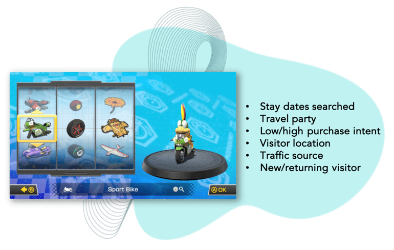
Examples of relevant segmentation rules for hotel websites
Item Boxes: Boosting Direct Bookings with Personalized Messages
In Mario Kart, players can collect Item Boxes to gain advantages during the race, whether it's securing protection from incoming attacks or launching an offensive move to take the lead. Similarly, hotel websites can leverage personalized messages with THN’s Conversion and Personalization platform, to boost direct bookings.
These personalized messages are strategically placed at key points during the user journey. They can highlight limited-time offers, exclusive perks or tailored recommendations, capturing the visitor's attention and nudging them towards direct bookings. Just like the Item Boxes in Mario Kart, these personalized messages provide an extra layer of excitement and engagement, turning the user journey into a motivating and rewarding experience.
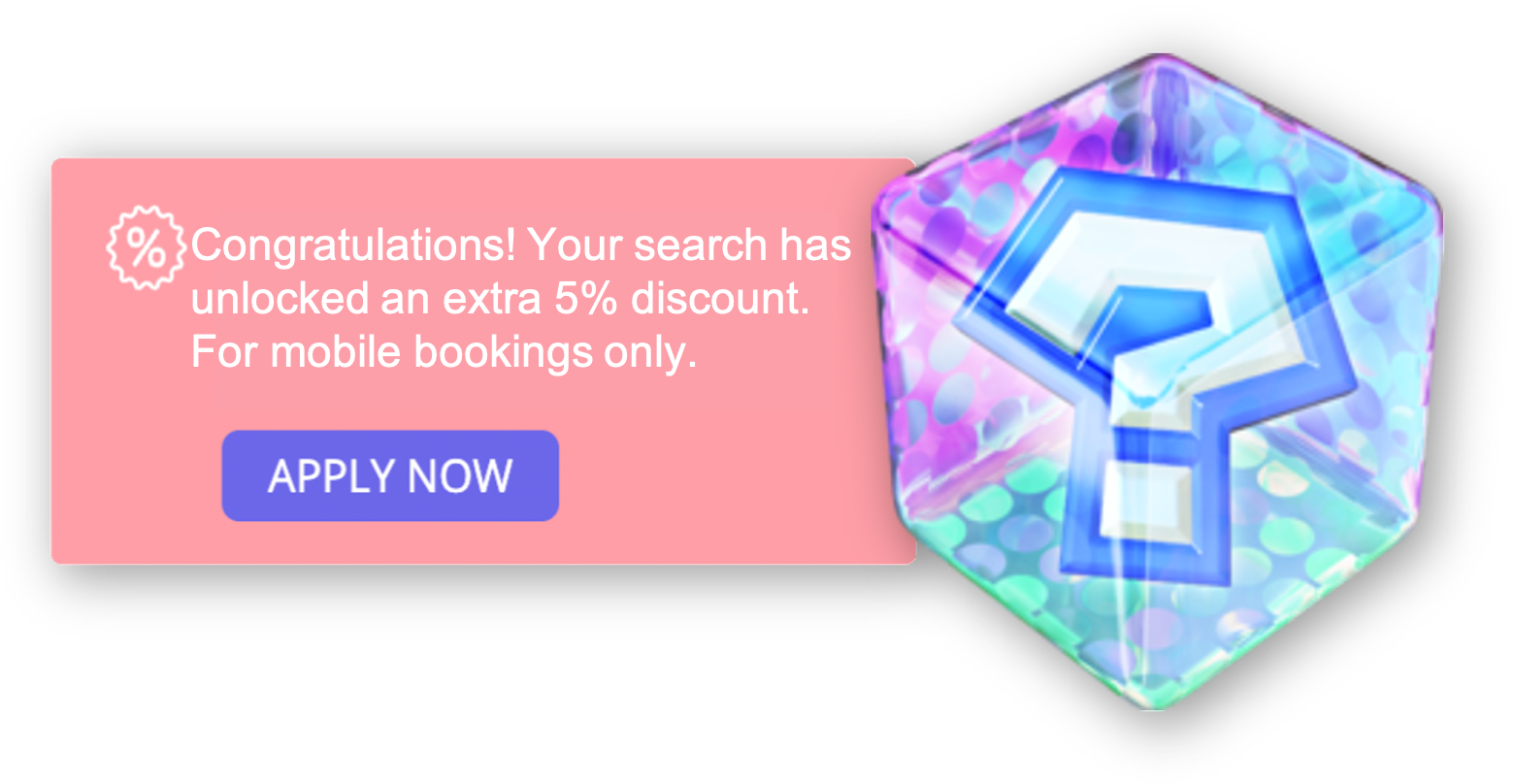 Example of a Smart Note message highlighting an exclusive direct booking perk
The Race Begins: The Three Laps of the User Journey
Lap 1: The Homepage - Setting the Stage for an Immersive Experience
The first lap in our Mario Kart-inspired user journey corresponds to the hotel website's homepage. This is where the race begins, and the visitor gets their first taste of what the hotel has to offer. Through captivating visuals, informative content, and intuitive design, the homepage creates a compelling first impression, just like the starting line of a race. The visitor can explore the hotel's amenities, services, and unique selling points, setting the stage for an immersive experience.
To make sure your visitors advance to the next lap, the booking engine, be sure to tempt them with appealing Item Box offerings. These may include irresistible flash sales that create a sense of urgency, discreetly displayed client reviews to alleviate any doubts, or exclusive advantages reserved for new newsletter subscribers. To maximize the impact of these messages, use targeted segmentation, tailoring the content to each visitor’s preferences, and include a compelling call to action (CTA) that leads them directly to the booking engine - entering lap 2 of their journey!
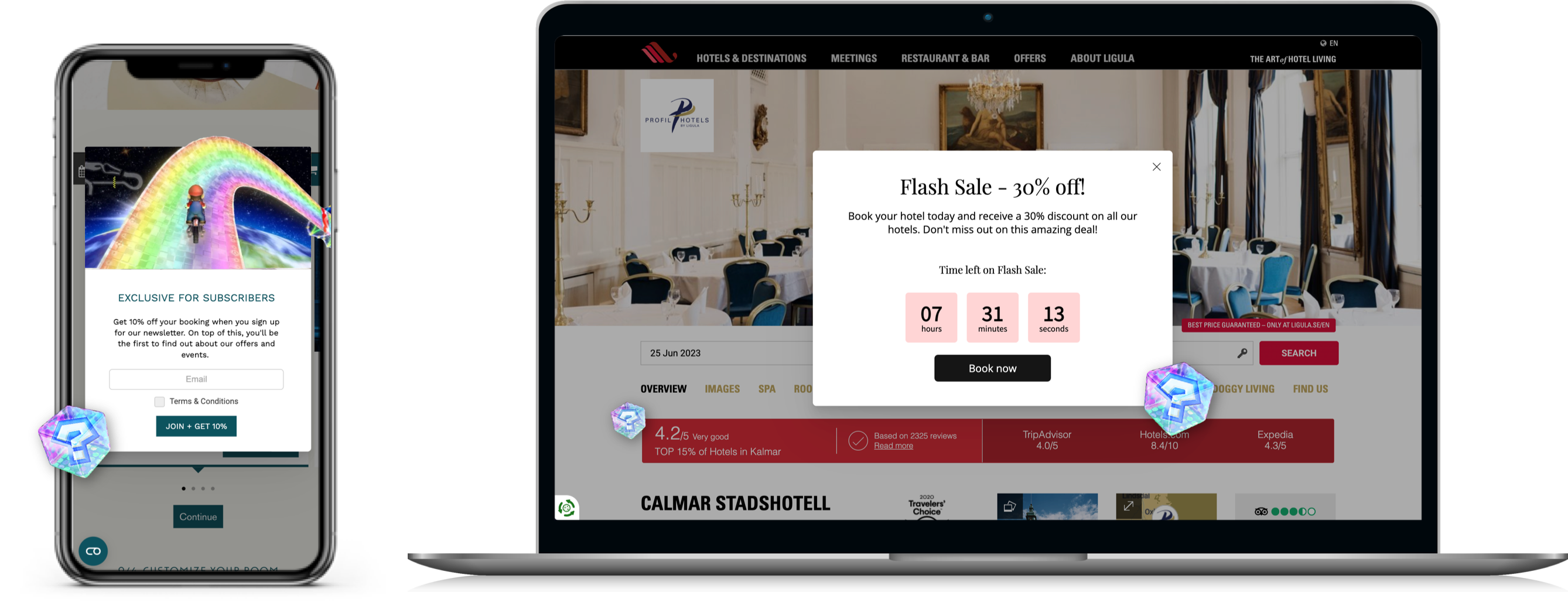 Compelling customized messages on the homepage guiding the user to the booking engine
Lap 2: The Booking Engine - Accelerating Towards Conversion
As the visitor progresses to the second lap, they reach the crucial phase of the booking engine - a parallel to the exhilarating rush of speeding through Mario Kart's circuit. The booking engine must deliver a seamless and user-friendly experience, optimized for conversion. It should empower visitors to make reservations effortlessly, presenting clear pricing, availability, and enticing offers.
Similar to collecting power-ups in Mario Kart, personalized messages strategically positioned throughout the booking process enhance the visitor’s experience and nudge them towards completing their booking. Picture the boost of a 10% discount, exclusively available to mobile visitors, making them feel acknowledged and valued. Imagine a message highlighting that your hotel website offers the best available rate online, eliminating the need for visitors to embark on an extra lap of checking each OTA individually, in search of a better offer.
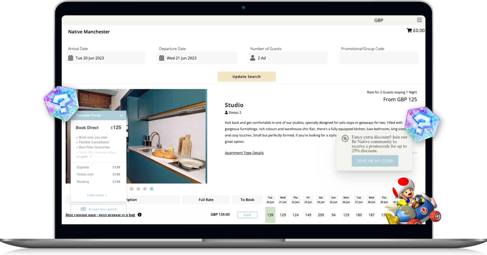 Price Comparison and Smart Note displayed in Booking Engine
Lap 3: Booking Success - Crossing the Finish Line
As the race on the hotel's website comes to an end, the finish line represents booking success, the outcome of the overall user journey on the hotel's website, encompassing everything from landing on your website to confirming the reservation. Just like the thrilling moments before crossing the finish line in Mario Kart where players think about all that has happened throughout the race to justify the outcome and do everything in their power to reach the best final position possible, the same process happens in the mind of your website visitors. They think about all of the enticing and tailored messages they encountered along their website journey.
However, the race is not over yet. As the finish line approaches there is risk of last-minute distractions or temptations to book elsewhere, which could lead to cart abandonment. Users may need to be persuaded by a final bonus, which can be expertly communicated with an Exit message, triggered at the precise moment a visitor is detected attempting to leave the website.
You are the creator of the race, so you have the power to offer just that. Encourage more direct bookings by fostering a sense of exclusivity and reward your visitors with attractive perks or personalized up-sell offers.
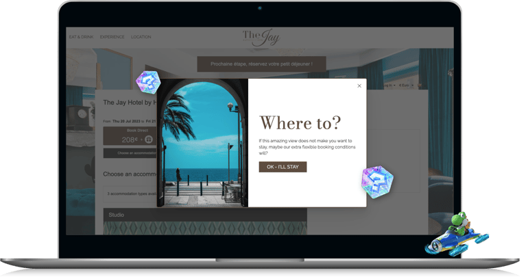 Exit message to grab the attention of visitors about to leave the website
By infusing the user journey with the spirit of Mario Kart and embracing personalized interactions, hotels can optimize their websites for maximum conversions. Tailoring the website's content and design to each visitor creates a seamless and engaging journey, akin to racing through a thrilling circuit. Strategically placing personalized messages, inspired by the iconic Item Boxes in Mario Kart, further elevates the user experience, enticing visitors to surge towards the finish line and confirm their direct bookings. So, gear up, fasten your seatbelt, and get ready to embark on an exciting race towards securing more direct bookings on your hotel brand's website – Mario Kart style!

